We talk to Patrik Prusak, Manager and Head Designer of Apparel & Lovers, about the creative process behind the 'Concrete Utopia' collection.
What was the inspiration behind the Barbican collection?
Barbican means different things for different people. The architecture is obvious but for some Barbican may stand for music, cinema, art or even home.
At the start of our design process we researched the Barbican thoroughly, starting from its history, and the era in design that the aesthetic and functionality of Barbican’s architecture spawned from. We also researched the Barbican's cultural offering, the apartments, and most importantly the people who make Barbican what it is. Without the people it would just be a pile of concrete.
We also researched the Barbican's cultural offering, the apartments, and most importantly the people who make Barbican what it is. Without the people it would just be a pile of concrete
What was your creative process when designing the range?
Initially, we were kind of overwhelmed by all the different assets, so we worked with the Barbican Shop's creative team to filter the assets and design ideas that represent Barbican and its modernist aesthetic in the most recognisable way.
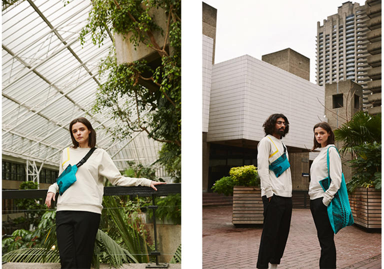
We started by creating a unique cut for the Barbican t-shirt and sweater that would already speak for the Barbican - and thus the 'Barbican cut' was born - the 90 degree 'brutalist' angle in the sleeve cut of the shirts, that also carries over to the minimalistic square design of the cross body bag.
For the prints we used the most iconic assets of Barbican: the towers and the tile patterns found on the centre's facade
Drawing from Bauhaus aesthetic, we added some graphic lines, some strong primary colours, as well as a touch of retro futurism with the transfer tape material, which is used in the red and yellow lines. The Yellow line and 90° turns also connect to the yellow guide line that can be found on the deck of Barbican estate, guiding visitors to the Centre. We noticed that this strong, visual element had been used by other designers, as well as in a set of postcards available in the Barbican shop - a funny coincidence really.
For the prints we used the most iconic assets of Barbican: the towers and the tile patterns found on the centre's facade, printed in subtle natural white. For the artwork of the tote bag and cross body bag, we used a photograph we shot on location, which provides a nice contrast to the minimalistic and graphic style of the collection.
One of the most fascinating and inspiring characteristics of Barbican is the romanticism of the futuristic failed utopia
What inspires you about the Barbican and its surrounding area?
For me, one of the most fascinating and inspiring characteristics of Barbican is the romanticism of the futuristic failed utopia. At the time of its creation, Barbican like many other brutalist constructions were a sort of a prototype for the kind of architecture and living that was expected to become the norm.
I am a big fan of retro science fiction - I could see Barbican with its conservatory as a set in a dystopian sci-fi film from the 60s.
What are your favourite items from the collection?
My personal favourite is the cross body bag. There is a strong statement in its bold shape, colour and print artwork. Its design really is quite unique and offers a simple, yet powerful tool for spicing up even a modest look.

